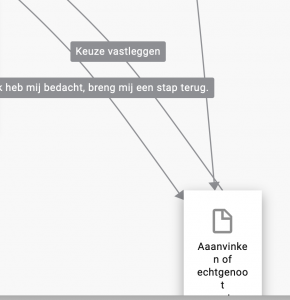
IN order to be able to understand what you are doing, it is super helpful that we get a visual representation in Designer. However, If you take a look at the two screenshots below, you’ll see that arrows often overlap and therefore are no longer readable. It would be a great help if:
- Either arrows would have a bit more space automatically, or
- If you could pick up a connector and create a bit of space in case you’ve used a lot of text to explain what the connector does.